


With most things orange now muted from my newsfeeds, I’m finally able to catch up on other headlines. Several that caught my eye involve the Walmart rebrand a few weeks ago. While I’ve never been a fan—or frequent customer—of Walmart, I have to give credit where it’s due: their recent “big” rebrand was a smart—if subtle—move.
Despite what the internet may say or think, evolving a logo is usually the best choice.
Walmart’s biggest mistake? Assuming anyone would be a “fan” of the rebrand.
As someone who’s been involved with more branding and rebranding campaigns than I care to remember—the professional PTSD is real, y’all—I’ve noticed that people tend to like the first logo they see and react negatively to anything that comes after it.
Yet marketing and PR teams continue pushing rebrand stories, subscribing to the old “any press is good press” philosophy.
Maybe they’re right, but as a former art director and designer, I know how the brutal, inevitable backlash feels after so much hard work and after so many sleepless nights.
From my perspective, corporate rebrands suck. And not in a good way.
Escaping the rebrand rat race was one of the main reasons I started Collide Press. Exhausted from endless meetings about minutiae, who has the time or patience to explain color theory or type psychology to a roomful of executives who just want to “make the logo bigger” and “make it pop.”
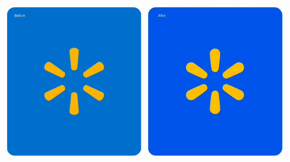
But, I digress…back to Walmart. For the largest retailer in the world, an “evolutionary” rebrand makes far more sense than a dramatic overhaul. And that’s exactly what they did. The “new” logo is a refreshed version of their “old” logo. With an updated color palette and typeface choices. Not all that different.
If it ain’t broke…

Walmart’s rebrand refines and refocuses the company’s visual identity while keeping it familiar to the millions who walk through their doors every day. In that sense, it’s a success.
And if the company hadn’t announced it, most customers probably wouldn’t have noticed the difference. But they might have felt it. Subtly at least.
Compare that to Jaguar’s recent rebrand—a total reboot of their classic logo in favor of an ultra-minimalist, soulless wordmark that ditches years of brand recognition.
This kind of "tabula rasa" approach can work in some cases, but more often than not, it just ends up alienating existing customers and fans and failing to attract new ones.
I mean…who does Jaguar think it’s designing cars for now? Ken and Barbie?

Why do I care about branding so much? As a designer, I still love the “inside baseball” of visual identity. As a business owner, I’m now the sole decision-maker on a process that usually takes entire teams. And as a citizen of the world, I’m fascinated by how we collectively base so many of our decisions on how something looks or feels.
From global corporations to independent solopreneurs like myself, branding matters.
Now did I spend $1,000,000+ for my logo or style guide? Of course not. I’ve got bills to pay, so I DIY’d it myself. For better and probably worse, I’ve made and remade the Collide Press “brand” several times. And only rarely have I mentioned the changes.
Like Walmart, I prefer rebrands to be less about new directions and more about fresh approaches—thoughtful, considered, and just different enough to move the needle forward without losing sight of the past. In a world where attention spans are short and familiarity breeds trust, that’s—in my opinion—a winning strategy.
Have a great day all!
Clint 🌈✌️
FOR YOUR CONSIDERATION
Walmart's New $1 Million Logo (Linus Boman)
Walmart’s New Logo Is Making The Internet Mad (Callum Booth/Forbes)
Yahoo’s New Logo Design: Micromanaged, Over-Engineered, Boring (Inc.)
IN CASE YOU MISSED IT
Saturday = More Love + Less Hate
Friday = Keep Calm + Keep Hope Alive
Thursday = Keep Calm + Edit On?
Wednesday = What Color IS My Parachute?
Tuesday = Orange = Just Say "Whoa!"
Monday = Remember + Never Forget
Sunday = Routine + Rebellion
ON THIS DAY = FEBRUARY 2
BIRTHDAYS
1859 = Havelock Ellis = English physician and writer 🌈
1861 = Solomon R. Guggenheim = American businessman and philanthropist
1882 = James Joyce = Irish novelist, short story writer, and poet
1923 = Liz Smith = American journalist and author 🌈
1925 = Elaine Stritch = American actor and singer
1938 = Bo Hopkins = American actor
1942 = Graham Nash = English-American singer-songwriter
1947 = Farrah Fawcett = American actor and producer
1948 = Ina Garten = American chef and author
1954 = Christie Brinkley = American actor and model
1962 = Michael T. Weiss = American actor
1973 = Marissa Jaret Winokur = American actor and singer
1977 = Shakira = Colombian singer-songwriter
1996 = Paul Mescal = Irish actor
EVENTS
1653 = New Amsterdam (later renamed The City of New York) is incorporated.
1913 = New York City's Grand Central Terminal, the world's largest train station, opens just after midnight.
1922 = Ulysses by James Joyce is published.
1954 = George Balanchine’s The Nutcracker premieres in NYC.
1972 = Stanley Kubrick’s A Clockwork Orange is released in US theaters.
2000 = Texas Instruments' DLP Cinema projector is publicly demonstrated, by Philippe Binant, on one screen in Paris for the release of Toy Story 2.
HOLIDAYS + OBSERVANCES
PORTRAIT + QUOTES OF THE DAY
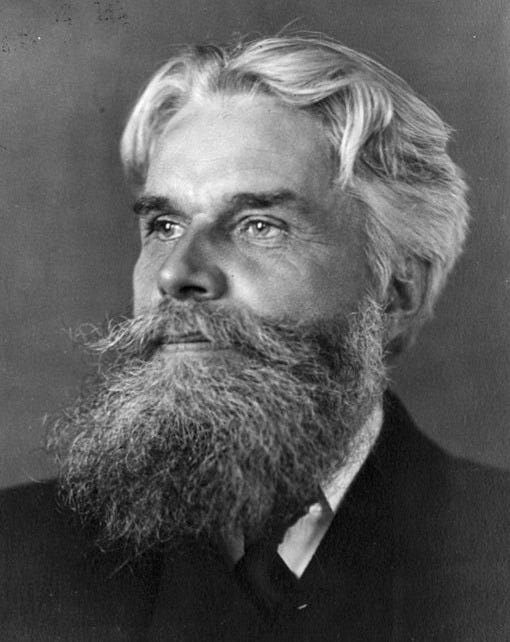
“All the art of living lies in a fine mingling of letting go and holding on.”
Havelock Ellis
“Sex lies at the root of life, and we can never learn to reverence life until we know how to understand sex.”
Havelock Ellis
Loved reading this a week before my own lil rebrand launch. Had no idea all the experience and history of branding and design you have! 🥰
Not a fan of rebranding. Just leave it alone. Have seen some products that I like undergo changes and 95% of the time it's a waste of time, money and effort.